Wednesday, 30 March 2011

Friday, 25 March 2011
Wednesday, 23 March 2011
Thursday, 3 March 2011


Rough Cut Feedback


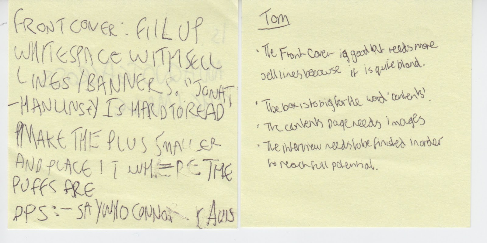
I think that the thing i will improve the most on my front cover is the amount of sell lines as this is what most people have told me that needs improving. On my contents page I still need images for it as I have not had enough time to get them yet as the people who said they would be on it were ill on the day of the photo-shoot. On my double-page spread I will be adding some quotes so it doesn't look as bare and i will also need to be finishing my article.
Monday, 14 February 2011


Friday, 11 February 2011


Thursday, 10 February 2011




Wednesday, 9 February 2011
Flat Plans
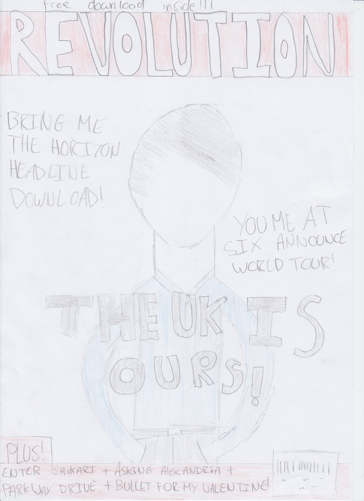


These are the basic ideas and layout for my magazines front cover, contents page and double page spread. The skyline on the front cover will probably be made bigger when it comes round to making the actual magazine as it looks a bit small. Also on the front page I will add more sell lines and use a distorted font. The distorted font I will use will be part of the theme throughout the magazine. The contents page isn't in a lot of detail but I know the basic layout of it and I will build from that. The double page spread lay out will be the same but I'm not to sure about the pose used so I may change that. I also have to include an article yet and some quotes around the pages.
Friday, 4 February 2011
Wednesday, 2 February 2011
Font Research

I like this font and would think about using on my magazine although I wouldn't know for definite.

I don't like this font much and will more than likely not use it on my magazine.

This font is a lot different than the other types of fonts in my research and it is a lot more brighter. Because of that I will not be using this font.

I like this font and i would definitely give some thought about using this font in my magazine.

I also like this font but not as much as the previous one so I would think about including this in my magazine.

Wednesday, 26 January 2011
Photography Research

It is a medium-long shot. Because of that the image wouldn't be a front cover photo. Also the facial expression wouldn't generally be seen on a front cover. The pose she is doing wouldn't suit the type of genre the magazine is based on. The eye line is in the top third of the frame which is good.

It is a medium-close up shot, so it wouldn't usually be used on the front cover. The pose also wouldn't be used on a front cover either. Because of the facial expression it wouldn't be used in the genre of magazine I am going to make. The eye line is in the top third of the frame again which is important.

It is a medium shot which would suit the front cover of a magazine. The facial expression wouldn't fit the genre of the magazine I want though. The pose is okay for the magazine and could suit the front cover. The eye line is once again in the top third of the frame which is good.

It is a medium-close up shot but that image its self wouldn't be very good for a magazine at all. Her facial expression wouldn't suit the genre of the magazine and the pose wouldn't be good enough for a front cover. The only good part is that the eye line is in the top third of the frame.

This image is a long shot. The pose is good and the use of props relating to the genre of the magazine is also good. The facial expression could do with being a bit more serious as that type of expression isn't good enough for the genre of my magazine. I could use this as a front cover image if there is enough room for the mast head but it would be more suited for use in a DPS. Finally the eye line is in the top third of the frame is is good.
My photography test shots has created ideas for my magazine as I now know that there has to be a variety of different shots in the magazine instead of them all doing the same pose or looking similar.
Monday, 24 January 2011
Wednesday, 19 January 2011
Audience Research
Looking at the reader profile for Kerrang it's apparent the majority of the readers are male between the age of 16-25 (the average age being 19). They are well educated and prefer alternative to mainstream. They are from upper middle to middle class backgrounds.
NME Reader Profile
Looking at the reader profile for NME magazine the majority of readers are male and are between the ages of 20 - 28 ( the average age is 24). Also a majority of them are working full-time and they spend a lot of money on clothes and the latest electronic gadgets. They also tend to like to be well informed about the latest news and gossip. Since they spend a lot of money they will probably's be in the middle class social standing.
This information leads me to analyse the psychographic profiling of the target audience of this genre of music magazine. Applying the personality traits of using the internet, gaming, buying new drinks and spending a lot of money on clothes and preferring alternative music it could be argued that target audience are a subtle blend between the following tribes;
From viewing these mini documentaries there is a lot of emphasis on hairstyle, fashion and outlook on life. There to successfully appeal to all 3 tribes i would need to find some common denominators such as;
- Hairstyles - They all tend to focus on their hair and boys would have long hair.
- Clothes - They all take pride in what they wear and will not not go out if they look scruffy.
- Music - They all like listening to rock music or music around the rock genre such as: emo, indie, metal etc.

This is a picture of my own reader profile for Kerrang magazine.
I have included in it the type of clothes people who like the
magazine wear, the type of music they listen to and other
images that show that type of person such as shoes, games
and a regular use of the internet.
Looking at the reader profile for NME magazine the majority of readers are male and are between the ages of 20 - 28 ( the average age is 24). Also a majority of them are working full-time and they spend a lot of money on clothes and the latest electronic gadgets. They also tend to like to be well informed about the latest news and gossip. Since they spend a lot of money they will probably's be in the middle class social standing.
This information leads me to analyse the psychographic profiling of the target audience of this genre of music magazine. Applying the personality traits of using the internet, gaming, buying new drinks and spending a lot of money on clothes and preferring alternative music it could be argued that target audience are a subtle blend between the following tribes;
From viewing these mini documentaries there is a lot of emphasis on hairstyle, fashion and outlook on life. There to successfully appeal to all 3 tribes i would need to find some common denominators such as;
- Hairstyles - They all tend to focus on their hair and boys would have long hair.
- Clothes - They all take pride in what they wear and will not not go out if they look scruffy.
- Music - They all like listening to rock music or music around the rock genre such as: emo, indie, metal etc.

This is a picture of my own reader profile for Kerrang magazine.
I have included in it the type of clothes people who like the
magazine wear, the type of music they listen to and other
images that show that type of person such as shoes, games
and a regular use of the internet.
Tuesday, 19 October 2010


Subscribe to:
Posts (Atom)